THE PROJECT
I was reaching the very of my UX Design Program. It has been more than 500 hours of hard work and it was time to dive in my favourite part: designing a web's app interface.
I have chosen to design a fitness web app. Whoever knows me would say: "whaaaat? Since when are you interested in sports of any kind?"
And it's because I was the kid bringing certificates of any kind to skip sports lessons at school. Actually, I spent my gym classes drawing on the floor seeing my classmates sweat. Easy.
When I grew up, I have managed to follow a yoga class here and there but that was pretty much my experience with exercise. Two years ago I became a mum and things got even worse. I am officially out of any fitness circuit. However, I recognise that exercise is very important and I have tried to start over again. But now the main obstacle is the irregular schedule and the lack of time.
I also see my husband, who use to go to the gym every morning for two hours, and other parents struggle with the same issue. After months of "letting yourself go" your aim is to get back on track.
Oh, back on track, I love that name. Let's name my web app that way.
The app's goal is to incorporate an exercise routine to an overloaded parent's schedule through short exercises they can follow along their day.
" It's not difficult to take care of a child; it is difficult to do anything else while taking care of a child" - Juliane Moore
USER FLOW DIAGRAM
Because the research and user stories were given, I analysed each of them and build several user flows. After I have put them all together in diagram showing an overall of the app's functionalities. In order to build it, I have used the web app " Lucid Chart"

LOW FIDELITY WIREFRAMES
I normally do my sketches with a good old marker and paper but this time I wanted to try Balsamiq. I was pleasantly surprised because it was very easy to use and it had many already built components that made much easier the process of translate visually the functionalities.
I have created more than 20 wireframes for the 7 user stories given but, due to time constraints, I was not going to be able to build them all so I prioritised three functions more relevant to the targeted users:
1. The Intake process: Users need to introduce plenty of personal, professional and fitness data for the app to create a tailor made routine.
2.Calendar: Main tool that they rely in coping with so many tasks during the day
3.Home screen: Where you can search for exercises filtering different criteria.


MAIN FOCUS: INTAKE PROCESS
After building the wireframes, I have realised an initial point of friction with users during the intake.
One of the app's advantages over other fitness app's is the fact that the exercise routine will be personalised based on the user's daily schedule. But to do so, the app will need to gather plenty of personal and professional data during the app's intake.
We know that many users can be very reluctant to provide such personal information, even more being the intake the first point of contact with the app.
To solve this problem, together with the time limitation due to the short nature of the specialisation course, I have decided to focus my work in designing the user's intake.
To make the intake process less intimidating and more friendly from user's perspective, I decided to build a set of spot illustrations to accompany them during in the process.
GRIDS & BLOCKING OUT
I based the full design in an 8-pixel grid and, in order to increase responsiveness while upscaling the design, based on a 12 columns layout. Here the settings and the block foundation


BASIC LAYOUT
After I set up the grid, I have replaced the app's building blocks using sample Illustrations taken from the plugin Blush plus iOS and material design components to set up the foundation where I will build my own design later on.
The reason I have decided to place these illustrations instead of my own is because I wanted to see what was the overall effect of the illustrations in the design before spending time in creating my own.

The illustrations belong to the collection "Big Shoes" by Elina Cecilia Giglio & "Tech Life" by Karthik Srinivas which you can find in blush.design
ILLUSTRATION CONCEPTING
The idea of the fitness app targeted for busy parents can be summarised in: fitness made simple. Therefore the illustration style needed to match that goal so I kept a very simple style, with flat vector illustrations and a limited color palette of three main colours plus one tint and one shade plus white for few details.
To avoid too much simplicity, I have decided to build the illustrations with mainly irregular and abstract shapes and I haven't used barely any shading or perspective illusion.
First I have worked in pen and paper to build the concepts around and after I sketch rough sketches in photoshop. Also I built a preliminary style sheet with the most important illustration's parts to serve me as guides when building the shapes in Illustrator.


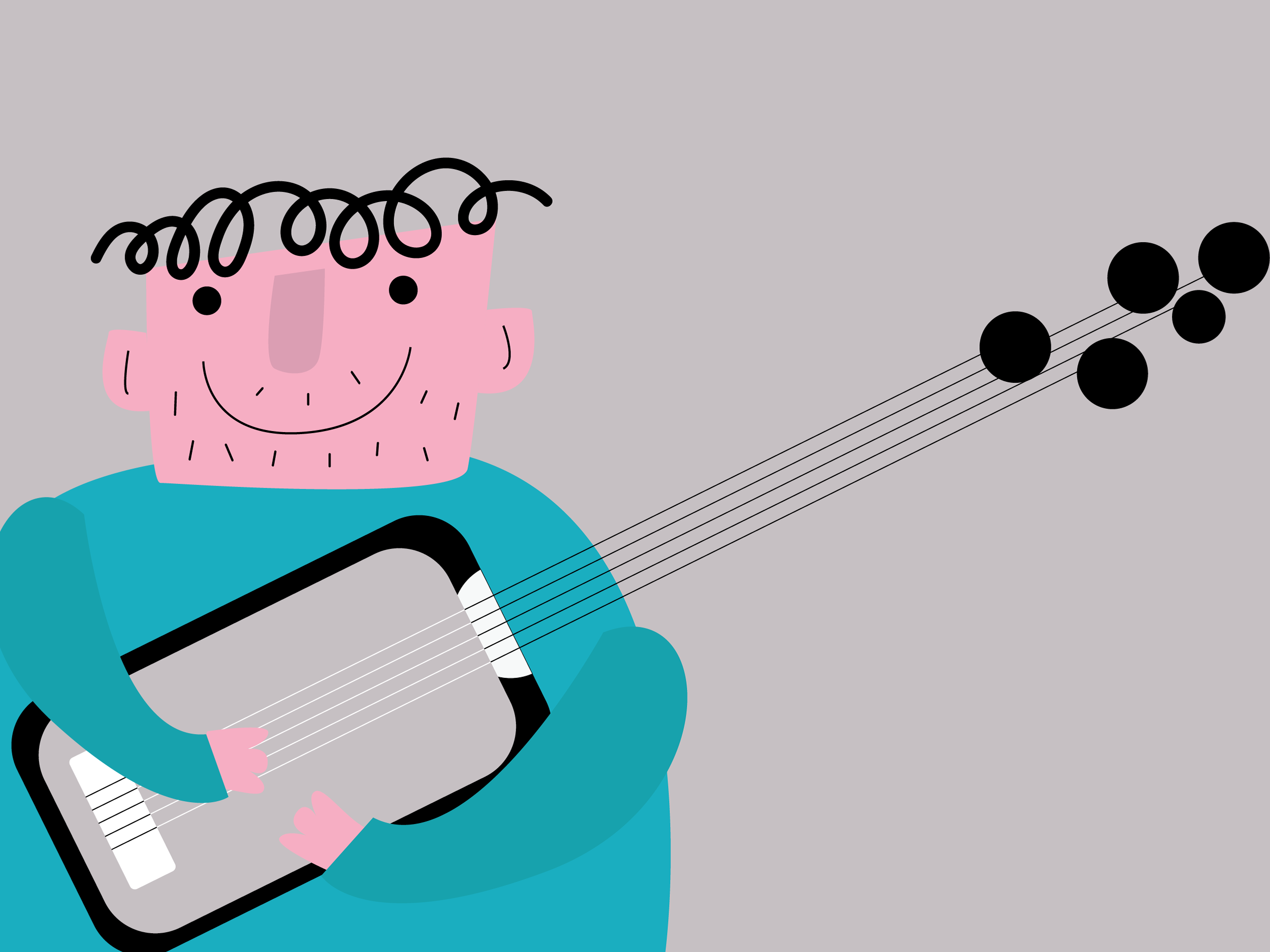
FINAL ILLUSTRATIONS


MOODBOARDS
Visual way 1
“Back on Track” is a fitness app targeted to busy parents who would like to include simple exercises into their daily routines. The app’s motto can be summarised in the sentence “ Fitness made simple”
I have selected the words: Real Family, Functional Training and Playful/Fun as my main keywords.
Real parenthood means juggling crazy schedules and being far from the perfect portraits that social media show when you do a quick research.
Functional training implies training with common objects we all have home and simple exercises which can be perform in little time slots while doing our daily chores or routines.
Fun means that your objective is not becoming the next top athlete but just to keep a more balanced lifestyle while still enjoying time with your kids.
This visual path embraces imperfection and simplicity. We will use a bold color palette, simple but fun typography and wobbly illustrations over real pictures.
While looking for resources I was heavily inspired by the photography of Dave Engledow, who depicts hilarious pictures of himself and his daughter in daily life. Also midcentury illustration to keep colors bright, bold, simple, fun and abstract shapes.
From app design, I was inspired by the meditation App “Headspace” which follows the same principle “ Meditation made simple”. Last but not least I had a look at illustration of contemporary illustrator Olimpia Zagnolli as a way to depict characters and conveys messages with just composition, shapes and bold colors in a very simple but powerful way.
Visual way 2
While the app’s motto is still “ Fitness made simple”, this visual path embraces a different visual direction.
Words selected were Fit Family, Stylish Workout and Sophisticated as my main keywords.
In here, I would set the focus to families whose main goal is to get fit all together. Mums and dads whose previous life included lots of exercises and they would like not only to be back to their sports routine but also include their kids and create on them a healthy lifestyle habit.
This visual path embraces a more graphic style and an overall “ black and white” with a touch of color feeling.
We will prioritize pictures over illustrations and if the latter ones are used, should be in flat, vector style while keeping a certain sense of realism. We will mix pictures with graphic resources and we will also use typography in a bold way, even replacing main graphic elements in some screens.


COLOR PALETTE
After trying different color combinations, I have selected a monochromatic blue palette because it was
the more discrete and matching option. Because the illustrations are using a complementary color
scheme, the fact of adding a complementary color palette for the UI elements was not a good idea due to poor contrast. The option of picking an analogous palette was tempting at first but it was resulting in too many colors
which will distract the user as you can see below


TYPOGRAPHY
Now it is time of a very big topic: choosing app's typography. I have decided to choose two "Sans Serif" fonts as I wanted to give the app an overall modern look.
For the titles and headlines, I have chosen Bebas Neue. I have picked this font because it looks modern but strong at the same time with the thick strokes. I tried to avoid a more "rounded" type because the illustrations are quite rounded and blobby so I hope this fonts give more contrast to the design and not make it that that childish. Also I think it links well to the concept of power of training.
For the body and other elements like tags, button text and so on I have picked Roboto.
I know it is very standard type but I like how it was matching Bebas Neue because of it's simplicity and clarity. I have changed the leading for the body to make it more easy to read.
For the rest of the elements I just have played with the style and size to create contrast and hierarchy.
In the below screenshots we can see the before and after


ICON SET
The layout was already pretty busy and colorful enough but still I wanted to create personalized- funky-icons to avoid standard sets. I used them for the personalized exercises instead of the chips.
I decided to go for a vector plain looking icons but far from geometry to give a fun look.
Below you can see the before and after screens


RESPONSIVE DESIGN
In an hyper-connected world where all of use different devices at even different times of the day, make our design a responsive design is more important than never. I have created a sample of three screens in mobile, tablet and desktop sizes using a responsive 12 column grid.


STYLE GUIDE
I have summarised all the design and illustration parameters in the app's style guide for future designers and illustrators working in the app. Below you can see a few screens of the shared document.


FINAL MOCK UPS
I have all the screens ready and it was time to show my mentor how everything was looking in a real environment. Below you can see the final mockups which have been created with Photoshop.


CONCLUSION
It's been such an intense specialisation course where every task was building on top of the previous one and all together made possible to design this web app. I won't say it was always easy but instead I would say that it was worth it as I learned plenty along the road.
Also I have reinforced the fact that my favourite part of the whole process was the illustration's concepting and considering different visual ways to translate the app's core values and targeted audience. I had an idea of what I would like to do next but after this project it is even more crystal clear: product illustration is a path I would def like to try.
I'd like to thank my mentor, Benjamin Funk, for his support and enlightenment along the way, he was always great help.
If any questions, please don't hesitate to reach out!